You’ve got a photo that needs to become something simpler and cleaner. Maybe it’s a product shot headed for a laser engraver. Maybe it’s a portrait you want to turn into a coloring page. Maybe it’s reference art for a logo, tattoo stencil, embroidery pattern, or technical outline. The frustrating part is that most image to line art tutorials start at the wrong point. They jump straight to filters, trace buttons, or AI generators.
That’s why so many results come out brittle, noisy, or unusable.
The hard truth is simple. Crisp line art starts before conversion. If the source image is blurry, compressed, low-contrast, or cluttered, the converter only turns those flaws into ugly lines. Professional results come from choosing the right method for the job, then feeding that method a prepared image it can interpret.
I’m approaching this the way a working designer would. Not as a novelty effect, but as a production workflow that has to hold up in print, on screen, and inside downstream tools.
Why Turn a Photo into Line Art
A detailed photograph contains more information than many outputs require. A laser engraver doesn’t need skin texture and color transitions. A coloring book page doesn’t need background clutter. A vinyl cutter needs clean shapes, not photographic nuance. Turning an image into line art is the act of deciding what matters and removing the rest.
That’s why line art remains useful across very different jobs. Designers use it for logos, icons, packaging drafts, apparel graphics, and editorial illustration. Makers use it for stencils, woodburning, engraving, and CNC prep. Archivists and restorers use line extraction to study forms when the original image is damaged or visually noisy.

Three methods that actually matter
In practice, most image to line art work falls into three buckets:
| Method | Best for | Main strength | Main weakness |
|---|---|---|---|
| Raster editing | Stylized illustrations, textured sketch effects | High artistic control | Not infinitely scalable |
| Vector tracing | Logos, cutters, print graphics, technical outlines | Clean scaling at any size | Can simplify too aggressively |
| AI conversion | Fast drafts, concepting, bulk experimentation | Speed and accessibility | Less predictable output |
A lot of beginners treat these as interchangeable. They aren’t. A Photoshop threshold workflow can look great for a poster or social graphic, but it may fail when sent to a cutter. A vector trace can be perfect for signage, but it may flatten expressive details you wanted to keep. AI can produce a usable draft quickly, but it often needs cleanup before it’s production-safe.
Practical rule: Choose the method based on the final output, not on the tool you already know best.
Line simplification isn’t a trendy digital trick. It’s one of the oldest visual systems we have. The history of line art documented by Loooop Studio notes over 400 documented sites worldwide with contour drawings that predate civilization by 40,000 years, and the examples at Chauvet Cave include over 900 animal outlines dated to 30,000–32,000 BCE. That long history matters because the purpose hasn’t changed. A line isolates form fast.
For modern designers, that same logic applies to catalog graphics, technical diagrams, and simplified visual communication. If you want a broader perspective on how simplification fits into design production, graphic design workflow enhancement is a useful companion read.
Prepare Your Image for Flawless Conversion
Most failed conversions don’t fail in Photoshop, Illustrator, or an AI tool. They fail earlier, when someone starts with a weak source and hopes the software will rescue it. It won’t. Edge detection can only work with edges that are there.
If your input image is tiny, soft, noisy, heavily compressed, or poorly lit, every conversion method becomes more fragile. Raster methods produce speckled junk. Vector tracing creates broken paths and random bumps. AI tools invent strokes where they shouldn’t.

What to fix before you convert
A prepared source usually needs four checks.
- Resolution first: Small files don’t contain enough usable edge information for clean line extraction.
- Noise reduction next: Grain, JPEG artifacts, and sensor speckling often get mistaken for meaningful detail.
- Contrast control: A flat image hides boundaries. A slightly stronger tonal separation helps tools identify contours.
- Background simplification: Busy surroundings create lines you never wanted.
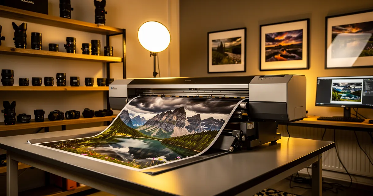
The most overlooked part is resolution. OpenArt’s photo-to-line-drawing guidance recommends strong source images, but the more useful point is what happens with weak ones: upscaling a blurry 480p image to 4K before edge detection can reduce artifacts by 40–60%, with AI enhancement models showing edge preservation improving after upscale. That doesn’t mean every image magically becomes perfect. It means the converter gets cleaner shape information and less pixel stair-stepping.
A practical preprocessing sequence
Here’s the workflow that saves cleanup time later:
-
Crop tightly around the subject
Don’t ask the converter to guess what matters. If the final artwork only needs the watch, shoe, face, or flower, remove the extra room around it. -
Upscale before any tracing or edge work
This matters most for screenshots, old photos, marketplace images, and anything pulled from messaging apps or compressed listings. -
Denoise carefully
Remove texture noise without erasing real form. Hair, fur, stitching, and etched metal need different treatment than a flat product silhouette. -
Correct local clarity
Portraits often need facial structure restored before line extraction. Product images may need edge clarity around seams or contours. -
Push contrast only enough to separate planes
Too much contrast clips midtones and fuses details together. Too little leaves muddy transitions.
Prepare the image until the subject reads clearly in grayscale. If it’s confusing in grayscale, it will be worse as line art.
This is also why ten minutes of prep often beats half an hour of cleanup. Broken lines usually trace back to soft edges. Random chatter usually comes from noise. Missing detail usually starts with low resolution, not with the trace setting.
If you want a manual editing perspective on this same idea, how to enhance a picture in Photoshop is worth reviewing. Even if you don’t use Photoshop for the final conversion, the image prep logic carries over.
What usually does not work
A few habits cause repeat problems:
| Bad input choice | What happens in conversion |
|---|---|
| Compressed marketplace image | Ringing and blockiness become fake contour lines |
| Low-contrast portrait | Eyes, nose, and jawline collapse into vague shapes |
| Cluttered background | Trace tools capture furniture, shadows, and wall texture |
| Tiny product thumbnail | Curves turn jagged and small details disappear |
Good line art is selective. Preprocessing is where that selection starts.
The Raster Method for Digital Sketching in Photoshop
If you want the line art to feel drawn rather than mechanically traced, raster editing in Photoshop is still one of the best approaches. It gives you control over texture, edge character, and selective detail. I use this method when the final file is meant to look illustrative, not purely technical.

The clean threshold workflow
Start with your prepared image and duplicate the background layer. Desaturate that duplicate so you’re judging structure, not color. Then add a Threshold adjustment layer instead of applying the effect destructively. That keeps the process editable.
Move the threshold slider until the core shapes hold together. Don’t chase every tiny detail. If pores, fabric grain, or dust become black clusters, you’ve gone too far. The goal is to isolate the dominant forms.
A useful pattern is to create two versions:
- Version one: lower detail, stronger silhouettes
- Version two: slightly finer detail for selective recovery
Mask between them rather than forcing one threshold setting to do everything.
Filter-based alternatives for different styles
Threshold is the blunt instrument. Filters give you style options.
The Filter Gallery can produce useful starting points for image to line art, especially with effects like Photocopy or Glowing Edges. I rarely trust them as final output, but they’re good for generating alternate edge interpretations on separate layers. Set one result to Multiply, another to Screen or Normal, then mask them together based on what each handles best.
That works well when one filter captures outer contours nicely but wrecks inner detail, while another catches facial features or product seams more gracefully.
Don’t use one filter and call it done. Use filters as raw material, then combine the parts that read well.
After that, manual cleanup matters. Add a blank layer and redraw weak transitions with a hard round brush. Erase isolated specks. Repair broken contours where the software hesitated. This hand pass is what makes raster line art feel deliberate instead of accidental.
A quick visual walkthrough helps if you want to compare hand-led drawing behavior with automatic conversion:
Where Photoshop wins and where it doesn’t
Photoshop is the right choice when you want expressive control.
- It’s strong for posters, editorial graphics, painterly line work, tattoo drafts, coloring pages, and social visuals.
- It struggles when the output needs mathematically clean paths for vinyl cutting, CNC routing, or logo systems.
- It shines with tablets because you can redraw, thicken, or taper lines by hand.
- It slows down when you need precise geometry across many assets.
One more practical tip. Keep the line layer separate from any white background. Even if your immediate use is simple, a transparent line-art PNG is far more reusable than a flattened file. It also makes later vector tracing easier if the project changes direction.
The Vector Method for Infinitely Scalable Line Art
When the final art has to scale cleanly, vector is the professional choice. That includes logos, heat transfers, vinyl cutting, signage, engraving prep, and large-format print. Pixels always have a limit. Paths don’t.
The key difference is simple. A raster line is a row of colored pixels. A vector line is a mathematical path with anchor points and curves. That’s why a vector outline can be resized without turning soft or jagged.

Illustrator versus Inkscape
Adobe Illustrator’s Image Trace is faster to dial in for many users, especially when you need preview-driven control. Inkscape’s Trace Bitmap is a strong free option and absolutely usable for production work. The choice often comes down to your environment, not to quality alone.
Here’s the practical split:
| Tool | Best mode to start with | What to watch |
|---|---|---|
| Illustrator | Line Art, Sketched Art, Technical Drawing presets | Too many points, over-detailed paths |
| Inkscape | Brightness cutoff or Edge detection | Harsh simplification, doubled edges |
For photos, start simpler than you think. A trace with fewer paths is easier to edit into a clean result than a hyper-detailed mess with hundreds of awkward bumps. For existing graphics or logos, you can usually push for tighter fidelity because the source is already simplified.
The workflow that holds up
A dependable vector workflow often looks like this:
- Convert to grayscale or remove color information before tracing.
- Run an initial vectorization pass to establish the main structure.
- Adjust stroke weight or outline thickness so the forms reproduce cleanly at target size.
- Refine manually by deleting junk shapes, smoothing curves, and simplifying points.
- Repeat if needed with a revised source image instead of forcing a bad trace.
That sequence matches common commercial practice. A workflow demonstration built around Inkscape and AI-guided prompting describes a multi-stage process of color removal, vectorization, outline thickening, and iterative refinement, with 3–4 cycles often needed to get consistent stroke quality.
A vector trace is a draft, not a verdict. The professional part is the edit after the trace.
This matters even more in apparel and print. If you’re preparing graphics for transfers or garments, optimizing artwork for apparel printing is a useful reference because it frames the raster-versus-vector choice around production constraints rather than aesthetics alone.
When vector tracing fails
Vector tools fail on ambiguity. Soft-focus portraits, reflective objects, and low-contrast scenes often produce unstable curves. Hair is another trap. If the hairstyle matters, you may need to simplify it manually into grouped masses rather than trying to trace every strand.
For logos and marks pulled from poor source files, remove the background first, then trace the subject only. Removing a background from a logo makes the trace cleaner because the algorithm isn’t trying to interpret shadows, paper texture, or surrounding clutter as part of the shape.
The AI Method with Instant Online Converters
AI tools are the fastest route from photo to outline. For many users, that’s the entire appeal. Upload the file, choose a style, and get a result in seconds. For concepting, rough drafts, social content, and non-technical artwork, that convenience is hard to ignore.
But speed changes the kind of decisions you make. With one-click tools, you usually trade fine control for momentum. You can get a compelling result quickly, but consistency across many files is harder, and line behavior may drift from image to image.
Where AI converters are useful
They work best when the source has a clear subject, readable contrast, and a background that doesn’t compete too aggressively. Product images on plain backdrops do well. Portraits with strong lighting often do well. Messy interiors and low-light phone photos usually don’t.
The strongest use cases are practical:
- Fast ideation: generate a few line styles before committing to manual cleanup
- Client previews: show the direction before investing in a full vector redraw
- Simple merch graphics: create a draft for later refinement
- Bulk experimentation: test many files to find the ones worth taking further
There’s also a growing operational reason to care about AI workflows. PhotoGrid’s line-art overview notes that searches for “batch photo to line art” spiked 180% year-over-year, and 78% of users in Printful’s 2025 merchant survey abandon workflows because batching is too slow. That gap matters if you’re handling catalogs, stencil libraries, or content queues instead of one hero image at a time.
The trade-off professionals run into
The problem isn’t only quality. It’s predictability.
A one-click converter may produce beautiful lines on one product image, then over-stylize the next one from the same shoot. That’s fine for inspiration. It’s less fine when a store needs a whole collection to look coherent. In those situations, AI is often best treated as the first pass, with raster or vector editing doing the final standardization.
Some teams already pair AI-generated product visuals with preview systems such as WearView AI, especially when they need to visualize how simplified artwork might translate into merch-facing assets. That kind of pairing is useful because it keeps conversion tied to the actual end use.
What to check before you trust the result
Use this review pass every time:
| Check | Why it matters |
|---|---|
| Line continuity | Broken contours create print and cutter problems |
| Feature accuracy | Faces, hands, and product seams often drift |
| Background contamination | AI may keep texture you meant to lose |
| Style consistency | Important when processing a set, not a single image |
If you’re comparing tool stacks for this kind of workflow, the best AI tools for photo editing is a helpful overview. The important mindset is to judge AI by job fit, not by novelty. It’s a strong assistant. It’s not automatic art direction.
Finalizing and Exporting Your Line Art for Any Use Case
Making the line art is only half the job. The file has to survive its destination. That means cleaning defects, closing shapes where needed, and exporting in a format that matches the production method.
The underlying logic is old. William Playfair’s The Commercial and Political Atlas introduced the line chart in 1786, a foundational example of turning complex information into clear lines. Modern image to line art work follows the same principle. Simplify, but keep what matters.
Final cleanup before export
Every method leaves a different kind of residue.
Raster outputs often keep stray pixels, uneven line weight, or isolated black specks. Vector outputs often carry too many anchor points, tiny accidental shapes, or curves that wobble more than they should. AI outputs can have both problems at once.
Use a final inspection pass at zoomed-in and zoomed-out views.
- Delete isolated artifacts that won’t reproduce well.
- Unify line weight where inconsistency looks accidental rather than expressive.
- Close open shapes if the file is headed to a cutter, engraver, or fill-based workflow.
- Test against white and transparent backgrounds so you can catch halo edges.
- Check small-size readability because a line that looks good large may collapse when reduced.
If the artwork has to be manufactured, test it at the final use size before you export the deliverable.
Choose the format by destination
Many otherwise solid projects go sideways at this point.
| Format | Best use | Why |
|---|---|---|
| PNG | Web graphics, overlays, digital downloads | Supports transparency and stays easy to place |
| SVG | Logos, icons, responsive web graphics, scalable print | Retains vector scalability |
| DXF | CAD, laser cutting, engraving, technical fabrication | Better suited to machine-driven workflows |
| PSD or AI working file | Internal revisions | Keeps layers and editability intact |
If you’re preparing files for print, scaling decisions matter before export. A practical guide on how to scale images in Photoshop is useful when you need to check size and resolution behavior during production prep.
For print-specific delivery, keep a master file first, then export copies for each use case. Don’t overwrite your editable source with a flattened final. If the line art may move into packaging, signage, apparel, or web later, preserving editability saves a lot of rework.
A short delivery checklist
Before sending the final file, confirm these points:
- The subject reads clearly at target size
- No unwanted background elements remain
- Lines are intentional, not accidental
- The export format matches the output method
- A master editable version is archived
If the destination is print, this guide to upscaling images for print at 300 DPI helps when you need to verify that the file will hold up physically, not just on screen.
If your source image is too small, noisy, or soft to convert cleanly, MyImageUpscaler is a practical place to start. It helps prep weak images before line extraction by improving resolution, reducing artifacts, restoring faces, and handling batch files in the browser, which makes the rest of the workflow far more reliable.
Frequently Asked Questions
Quick answers for this guide
What should I know about image to line art a multi method?+
Learn how to convert any image to line art with our guide. Covers Photoshop, Illustrator, and AI converters for crisp results on photos and graphics. Start with the highest-quality source file available, choose the smallest upscale factor that meets your target size, and inspect the result at 100% before publishing or printing.
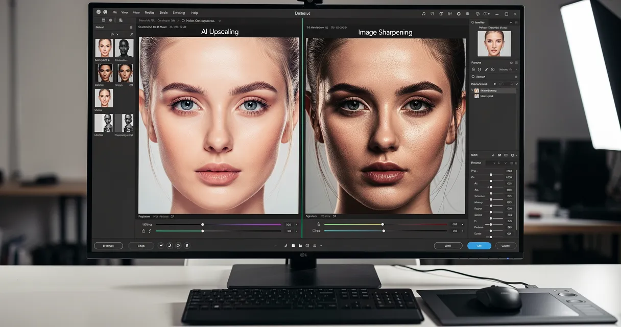
When should I use AI upscaling for this workflow?+
Use AI upscaling when the original image is too small for the target use case but still has enough detail to guide the model. For blog work, pay closest attention to source image quality, upscale settings, output dimensions, and final visual inspection, especially image to line art, photo to sketch, vector tracing.
How do I avoid losing quality after upscaling?+
Upscale once from the best original, avoid repeated compression, keep important text and edges sharp, and export in a format that matches the final use. If the output shows halos, smeared texture, or distorted text, reduce the upscale factor or use a cleaner source image.

Reviewed byJoao Furtado
AI Image Upscaling Specialist
Joao is the founder of MyImageUpscaler and an AI image upscaling specialist. He tests every guide against real upscaling workflows — comparing model outputs, evaluating sharpness and artifact tradeoffs, and validating tool recommendations before publication.
- AI image upscaling
- Model comparison
- Photo restoration
- E-commerce image prep