A blurry screenshot with unreadable numbers. A marketplace photo where the label turns to mush the moment you zoom in. A scanned family letter that looks fine at thumbnail size, then falls apart when you try to archive it properly. That’s usually when people start hunting for a text image enhancer.
The frustrating part is that text fails differently from photos. Skin can survive a little softness. Expansive scenes can obscure compression. Letters can’t. Once edges break, counters close up, or JPEG blocks chew through thin strokes, the image becomes hard for people to read and even harder for software to extract.
Most guides stop at “make it sharper.” In practice, that’s not enough. The ultimate standard is whether the text becomes usable again for presentation, print, cataloging, or OCR.
Why Your Image Text Is Blurry and How AI Fixes It
A common failure looks harmless at first. Someone drops a product screenshot into a slide deck, resizes it twice, exports the deck as a PDF, and sends it through chat. By the time it reaches the client, the specs panel is unreadable. The text wasn’t destroyed in one dramatic step. It degraded through repeated resizing and compression.

Text usually blurs for three reasons. The original file starts too small. The image gets saved in a lossy format like JPG too many times. Or someone enlarges it with standard resizing, which stretches existing pixels without rebuilding letter structure.
Since 2022, AI algorithms have generated over 15 billion images, averaging 34 million per day, which is one reason artifact repair matters so much in modern visual workflows, especially for text-heavy graphics and documents (AI image statistics from Everypixel). More generated visuals means more screenshots, composites, labels, and AI-made graphics that need cleanup before they can be trusted.
Why normal sharpening often makes text worse
Traditional sharpening boosts local contrast around edges. That can help a soft portrait. It often damages text.
On letters, aggressive sharpening creates halos, jagged diagonals, and dirty outlines around black-on-white type. Instead of restoring the shape of an “e” or the inner gap in an “a,” it exaggerates the damage already there.
Practical rule: If sharpening makes text look louder but not clearer, stop. You’re increasing edge contrast, not restoring character shapes.
That’s the line between a generic editor filter and an AI text image enhancer. A stronger tool tries to reconstruct cleaner edge transitions and more believable letterforms from the damaged input, rather than merely intensifying noise.
What AI is actually doing
Good AI enhancement doesn’t perform magic. If the source is reduced to a smear, no model can recover exact characters with certainty. But when the underlying shapes still exist, even faintly, AI can often stabilize stroke width, separate letters from background texture, and reduce the blockiness that makes text look broken.
This matters for more than legibility. If you publish generated visuals, it also helps to verify AI art with forensic tools before you treat a text-heavy image as reliable source material. Some images look plausible while hiding synthetic distortions in logos, labels, or fine print.
When the problem starts earlier in the pipeline, it also helps to diagnose the cause before enhancing. This guide on why photos turn blurry is a useful reference for separating focus problems, compression damage, and scaling issues.
Preparing Source Files for Maximum Clarity
Professionals get better enhancement results before they ever upload a file. Text restoration is a staging problem first. If the source is noisy, crooked, over-compressed, and cluttered with background detail, the enhancer has to solve too many problems at once.

Start with file format and crop discipline
For text-heavy images, PNG and TIFF are safer working formats than JPG. Lossy compression tends to create mosquito noise around letters, mushes fine strokes, and introduces blocks that AI may mistake for real edge information. If all you have is a JPG, keep it. Just don’t resave it repeatedly before enhancement.
Cropping is equally important. If the useful information is a receipt header, a product label, or the caption inside a social graphic, isolate that area. Don’t ask the model to process irrelevant table edges, shadows, fingers, or decorative background textures if they don’t matter.
A tight crop gives the enhancer a cleaner job. It also makes quality control faster because you can judge the text at working size without zooming around a large canvas.
Fix geometry before you upscale
Perspective distortion is one of the most overlooked problems in text workflows. A phone photo of a document can look “sharp enough,” but if the baseline tilts or the page bows, letters at the edges stretch unevenly. Upscaling preserves that distortion unless you correct it first.
Use a basic editor to straighten rotation and reduce obvious skew. If the document is visibly warped, dewarp it before enhancement. The same applies to packaging and labels photographed at an angle. Clean geometry helps both human reading and OCR later.
If the text lines aren’t straight before enlargement, they won’t become straighter after enlargement.
Preprocessing matters more than people think
Document pipelines that apply preprocessing such as binarization, deskewing, noise reduction, and contrast adjustment report a 92% OCR accuracy uplift after enhancement routines, which is a strong reminder that cleanup before enlargement isn’t optional in serious text extraction work (DocSumo on image enhancement workflows).
That doesn’t mean every image should be pushed into harsh black-and-white. It means you should remove the defects that interfere with recognition.
A practical pre-flight checklist looks like this:
- Check lighting first: For fresh captures, avoid glare across laminated labels, glossy paper, and screens.
- Clean physical originals: Dust, folds, and smudges become harder to remove after enlargement.
- Correct rotation: Even mild skew makes screenshots and scanned pages feel softer than they are.
- Trim dead space: Borders, desks, fingers, and shadows distract the model from the text.
- Preserve the cleanest copy: Save a working version in a lossless format before you test enhancements.
Match your prep to the final job
Not every file has the same destination. A product label for a marketplace listing needs readable ingredients and model numbers. An archival scan needs stable glyph shapes and minimal artifacting. A slide screenshot needs crisp UI type that survives export.
That’s why DPI and pixel dimensions matter before you print or run OCR. If you need to check or convert file resolution for downstream use, a practical online DPI converter helps you verify whether the enhanced file matches the output requirement.
The short version is simple. Better inputs don’t guarantee perfect text. Bad inputs almost guarantee bad text.
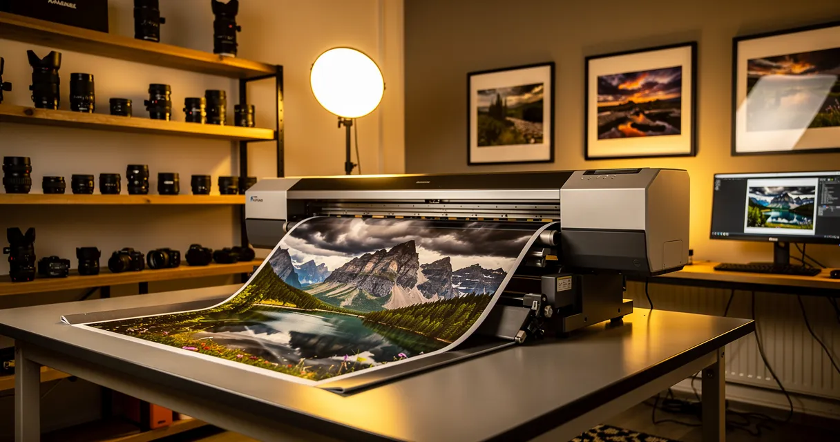
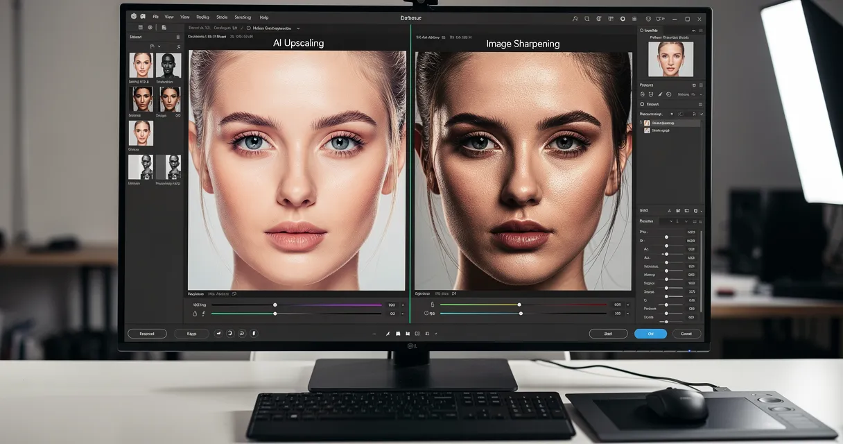
Enhancing Image Text with MyImageUpscaler
The most useful way to approach enhancement is to think in decisions, not buttons. Take a low-resolution product label screenshot. The brand name is legible, but the spec line and small instructions break apart at zoom. The job isn’t “make it bigger.” The job is to preserve edge integrity without inventing new typography.

For that kind of file, MyImageUpscaler’s AI sharpness enhancement upscaler is one practical browser-based option. It supports text- and logo-sensitive upscaling, along with different quality tiers and smart model selection for different image types. That matters because screenshots, labels, posters, and mixed photo-text compositions don’t respond well to one uniform treatment.
Pick the scale based on use, not optimism
A lot of failed results come from choosing the largest possible scale by default. That’s backwards.
For web use, a modest enlargement is often enough to clean edges and stabilize small text. For print or close inspection, you may need more. But the right scale depends on how much real structure exists in the source. If the original text is barely there, a giant upscale only makes the uncertainty larger.
Use this rule of thumb in practice:
- Choose a lower scale when the text is already mostly readable and you need cleaner presentation.
- Choose a mid-range scale when labels or screenshots need inspection at zoom.
- Choose a higher scale carefully for print prep or OCR workflows, but only after a test crop proves the letters hold their shape.
Select the mode that matches the image
Skilled operators optimize their workflow by understanding these distinctions. A photo-oriented model may preserve natural textures in paper, fabric, or packaging, but it can soften flat graphics. A graphics-focused mode can lock down edges and color blocks, yet make photographic surfaces look brittle.
For text work, don’t think in terms of “best mode.” Think in terms of best mismatch avoided.
| Enhancement Mode | Best For | Key Behavior |
|---|---|---|
| Graphics or Text | Screenshots, logos, UI panels, flat labels | Prioritizes hard edges, cleaner lettering, and stable flat colors |
| Photo | Packaging shots, signs in real scenes, paper documents with natural texture | Balances text cleanup with surrounding texture and lighting |
| Smart or Auto Selection | Mixed batches with varied content | Chooses a model based on image characteristics, useful as a starting point |
| Gentle Enhancement | Assets where typography is already decent and artifacts are the main issue | Reduces the risk of over-sharpened outlines and brittle edges |
A logo deserves extra caution. If brand typography must remain exact, inspect letter counters, spacing, and line weight after enhancement. Look closely at letters like R, e, a, S, and numerals with tight openings. These are often the first places where a model reveals over-interpretation.
Archive bench habit: Review the smallest important text first. If the tiny type survives, the larger type usually will too.
A reliable workflow for labels, screenshots, and scans
Use a short test pass before you commit a whole file or batch.
-
Crop a representative region
Pick the hardest area. Not the nice big heading. Use the small specs, serial line, or footer text. -
Run one conservative upscale
Start with a moderate setting. The goal is to see whether letter edges become cleaner without closing up counters. -
Compare at actual use size and at 100% zoom
Web graphics should be checked at display size. OCR and print assets should also be checked at full zoom. -
Inspect the failure zones
Watch for halos, stair-stepping on diagonals, false texture inside letters, and color fringing around dark text. -
Only then process the full image
If the crop works, apply the same logic to the full asset or the sorted batch group.
For print work, the file has to survive paper, not just screens. If you’re sending posters or graphic layouts to production, it’s worth checking how substrate choice affects perceived sharpness. This guide on how to choose the right poster paper is useful because paper finish changes how crisp text looks after all your enhancement work.
A quick visual walkthrough helps if you prefer to see the interface in action:
What works and what usually fails
The strongest results usually come from files where the original text is soft but still structurally present. Product labels, screenshots, scanned clippings, menu photos, and social graphics often improve well if you choose the right mode.
The weakest cases are predictable:
- Extreme motion blur: character strokes smear into each other.
- Tiny text with almost no pixel information: the model has too little to preserve faithfully.
- Heavy JPG damage: compression blocks create false edges.
- Mixed-content assets processed too aggressively: text sharpens, but surrounding photo areas turn crunchy.
The professional habit is restraint. A text image enhancer should make the file more dependable, not more dramatic.
From Readable to Machine-Readable Optimizing for OCR
A visually improved image isn’t automatically useful in automation. That’s the gap many guides skip. A label can look clean enough to a person and still fail when an OCR engine tries to extract a SKU, serial number, or date.
That matters in real workflows. Archivists don’t just want a restored page. They want searchable text. Ecommerce teams don’t just want a nicer package image. They want product details they can capture and reuse.

The baseline that actually matters
For OCR, image resolution isn’t a cosmetic detail. At least 300 DPI is essential for accurate OCR, according to image-to-text best practices and research on text image enhancement workflows (keys to high-quality image-to-text conversion).
That benchmark matters because OCR engines need enough pixel density to separate strokes, counters, punctuation, and spacing. If the file sits below that threshold, even a human-readable result may still produce extraction errors.
Human clarity and machine clarity aren’t the same
People are forgiving readers. We infer missing letters from context. OCR does not. It reacts badly to broken baselines, low contrast, touching characters, and dirty backgrounds.
That’s why some enhancement choices should be judged differently when OCR is the destination:
- Favor edge stability over texture drama: Decorative paper grain may look authentic, but it can interfere with extraction.
- Protect character separation: If letters start touching after enhancement, OCR accuracy usually drops.
- Watch background noise: Speckles and faint shadows can become false marks.
- Keep geometry disciplined: Straight baselines and square pages help recognition engines more than visual style does.
A good OCR-ready image often looks slightly plain. That’s fine. The priority is dependable character separation.
A practical OCR-ready check
Before sending a file into recognition, verify more than “it looks better.”
Use this short checklist:
| Check | What to look for | Why it matters |
|---|---|---|
| Resolution | Enough pixel density to meet the target output and OCR requirement | OCR needs clear character structure |
| Contrast | Clear separation between text and background | Weak separation increases recognition errors |
| Alignment | Straight lines of text, minimal skew | Tilted lines reduce consistency |
| Compression damage | No obvious JPEG blocks around letters | Artifact noise gets mistaken for character detail |
| Small text integrity | Counters in letters remain open | Closed counters confuse recognition |
When the image passes those checks, move it into an OCR tool and test a representative section rather than the whole batch. For direct extraction work, an online OCR tool is a practical way to validate whether the enhancement improved machine-readability, not just appearance.
The gap most content still ignores
There’s still a real blind spot in the market. Many text enhancement tools focus on readability for the eye and say very little about downstream OCR outcomes. That leaves teams guessing which settings help automation and which only improve presentation.
In daily practice, the useful question isn’t “Does the text look sharper?” It’s “Can a machine now read it reliably enough for the next step in the workflow?” That’s the standard worth optimizing for.
Professional Workflows and Troubleshooting
Single-image enhancement is easy. Production work is where judgment starts to matter.
A catalog team may process product photos, packaging shots, screenshots, and supplier graphics in the same afternoon. An archive project may include letters, typed forms, newspaper clippings, and faded book pages in one batch. Those assets don’t tolerate the same settings.
A key problem in bulk workflows is that one uniform enhancement model can over-sharpen some assets while under-sharpening others, which creates consistency issues across mixed image sets (text enhancement trade-offs in batch processing). That’s why experienced teams sort first and process second.
Sort batches before you touch settings
The fastest bulk workflow usually begins outside the enhancer. Create simple groups based on content type and failure mode.
A workable production split looks like this:
-
Screenshots and UI captures
Flat color areas, crisp interface text, and minimal texture. These usually need edge-sensitive treatment. -
Product photos with labels
Mixed-content files where the label must improve without making the packaging surface look synthetic. -
Document scans
Text-heavy assets that benefit from straightening, noise cleanup, and OCR-aware review. -
Historic or damaged materials
Fragile sources that need conservative handling because every stain, crease, and faded stroke competes with the text.
This one step reduces rework more than people expect. If you batch unlike files together, the enhancer isn’t failing. The batch design is.
Use review checkpoints, not blind automation
Teams often lose quality because they review only after the full run. That’s too late.
Instead, build a checkpoint system:
- Test one representative file per group
- Approve settings at 100% zoom
- Process the grouped batch
- Spot-check edge cases from the output
- Re-route failures into a manual queue
That small amount of control prevents the familiar outcome where half the images look brittle and the other half still look soft.
Bulk processing works when you automate the repetitive part, not the judgment part.
Troubleshooting common text enhancement artifacts
When text looks wrong after enhancement, the artifact usually points to a specific mismatch between source and settings.
Halos around letters
This appears as bright or dark outlines hugging the text.
Common cause: over-sharpening, or using a graphics-heavy model on a noisy photo.
Fix: lower the intensity, use a gentler mode, or reduce the upscale factor. If the file is a photo of packaging or paper, preserve more natural texture.
Jagged diagonals and brittle curves
This often shows up on letters like A, K, M, R, and numerals with angled strokes.
Common cause: weak source detail pushed too far.
Fix: go back to a smaller enlargement and test a cleaner crop. Sometimes a modest result is more faithful than a dramatic one.
Plastic-looking surfaces around text
The text may improve, but paper, cardboard, or fabric looks unnaturally smooth.
Common cause: an aggressive model flattening texture to simplify the scene.
Fix: use a photo-aware mode for mixed-content images, especially labels in real-world product shots.
Closed counters in letters
The inside spaces of e, a, o, p, or numbers fill in.
Common cause: too much edge thickening, poor contrast separation, or damage already present in the source.
Fix: back off the enhancement, improve contrast before upscaling, and inspect small text first.
Color shifts around black text
Dark text picks up blue, green, or magenta fringing after processing.
Common cause: compression residue in the original or model confusion around chroma noise.
Fix: start from the cleanest available file, avoid repeated JPG saves, and export in a format that preserves clean edges.
What experienced operators do differently
They don’t chase perfection in one pass. They test. They crop. They compare.
It is critical that they define success before they start. A social image needs legibility on screen. A catalog image needs readable product facts. An archive image needs stable OCR output. Those are different finish lines.
If you remember one thing, make it this: most “AI mistakes” in text enhancement are workflow mistakes. Wrong file group, wrong mode, wrong scale, wrong expectation.
Choosing Output Formats and Finalizing Your Assets
The last mistake happens at export. You rescue the text, then save it in a format that throws detail away again.
For screenshots, labels, logos, and document extracts, PNG-24 is usually the safest output because it preserves sharp edges and avoids fresh compression artifacts. TIFF also makes sense in archival or production environments where file size is less important than fidelity. High-quality JPG is acceptable when the image is mostly photographic and storage or page speed matters, but it’s a compromise for small type.
Use the output format that matches the job, not habit. Web graphics often need clean text at modest size. Print assets need enough resolution and stable edges. OCR inputs need clarity over visual style. If you need a quick refresher on the trade-offs, this image formats comparison guide is a practical reference.
A good text image enhancer doesn’t end with a sharper preview. It ends with an asset that survives delivery, whether a person reads it or a system extracts it.
If you’re repairing screenshots, labels, scanned pages, or text-heavy graphics, MyImageUpscaler is a practical place to test the workflow end to end in the browser. Start with a tight crop, validate the smallest text, and judge the result by both readability and OCR usefulness.
Frequently Asked Questions
Quick answers for this guide
What should I know about text image enhancer a to sharper, readable text?+
Use our AI text image enhancer guide to make blurry text sharp and readable. Learn to prep files, optimize for OCR, and run batch workflows for perfect results. Start with the highest-quality source file available, choose the smallest upscale factor that meets your target size, and inspect the result at 100% before publishing or printing.
When should I use AI upscaling for this workflow?+
Use AI upscaling when the original image is too small for the target use case but still has enough detail to guide the model. For blog work, pay closest attention to source image quality, upscale settings, output dimensions, and final visual inspection, especially text image enhancer, ai image enhancement, ocr preparation.
How do I avoid losing quality after upscaling?+
Upscale once from the best original, avoid repeated compression, keep important text and edges sharp, and export in a format that matches the final use. If the output shows halos, smeared texture, or distorted text, reduce the upscale factor or use a cleaner source image.

Reviewed byJoao Furtado
AI Image Upscaling Specialist
Joao is the founder of MyImageUpscaler and an AI image upscaling specialist. He tests every guide against real upscaling workflows — comparing model outputs, evaluating sharpness and artifact tradeoffs, and validating tool recommendations before publication.
- AI image upscaling
- Model comparison
- Photo restoration
- E-commerce image prep