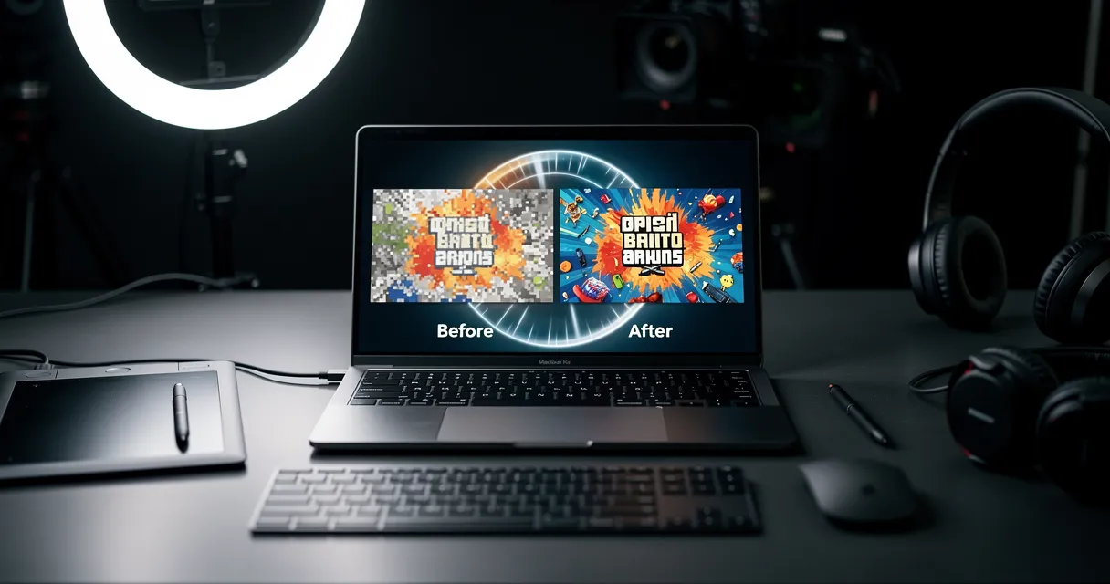
You upscale an image and everything looks great—except the text. Labels become unreadable. Logos turn into smudges. Fine print disappears entirely. This is one of the most common frustrations with AI image upscaling, and it has a technical explanation. The problem surfaces most in e-commerce product photo contexts, where ingredient lists and brand names must remain legible for compliance and conversions.
Here's why it happens and what you can do about it.
Why Text Is Harder to Upscale Than Photos
Most AI upscalers are trained primarily on photographs: faces, landscapes, animals, objects. The neural networks learn patterns like skin texture, fur, foliage, and fabric. When they encounter these patterns in a low-resolution image, they can convincingly reconstruct detail.
Text is fundamentally different:
1. Text Requires Pixel-Perfect Precision
A slightly smoothed face still looks like a face. A slightly smoothed letter becomes unreadable. The difference between a clear "e" and a blurry blob is just a few pixels.
2. Text Has Hard Edges
Photographs contain gradients, soft shadows, and organic transitions. Text has stark black-on-white (or colored) edges. AI models trained on photos try to soften these edges—exactly the wrong approach for text.
3. Small Text Has Minimal Information
At low resolution, small text might be only 5-10 pixels tall. That's not enough data for any AI to determine if it's an "a" or an "o" or an "e". The model guesses, and guesses are often wrong.

Try It Yourself
Upload your image and see the AI enhancement in action. Start with 5 free credits.
The Technical Problem: Training Data Bias
Most popular upscaling models (ESRGAN, Real-ESRGAN, etc.) were trained on datasets heavy with:
- Faces
- Natural landscapes
- Animals
- General objects
These datasets contain relatively little text. When the model encounters text, it applies photo-enhancement techniques that make text worse, not better.
Common artifacts you'll see:
| Artifact | What It Looks Like | Cause |
|---|---|---|
| Smoothing | Letters blend together | Model softening edges |
| Ringing | Halos around text | Sharpening overcorrection |
| Distortion | Letters change shape | Model "hallucinating" details |
| Color bleeding | Text color spreads | Chroma processing errors |
What Actually Works for Text
Several approaches can preserve or improve text quality during upscaling:
1. Text-Aware Upscaling Models
Some upscalers are specifically trained on mixed content including text, documents, and screenshots. These models learn to:
- Preserve sharp edges on letterforms
- Maintain consistent stroke widths
- Avoid adding texture where text should be flat

2. OCR-Enhanced Processing
Advanced upscalers can use optical character recognition (OCR) to:
- Detect text regions in the image
- Identify the actual letters
- Re-render text at higher resolution
- Blend the sharp text back into the upscaled image
This produces dramatically better results for readable text.
3. Separate Processing Pipelines
Professional workflows often:
- Upscale the image normally
- Extract text regions
- Process text with specialized algorithms
- Composite the results
This is time-consuming but produces the best results.
See the Difference
Experience crystal-clear upscaling that preserves text, logos, and fine details.
Practical Solutions by Use Case
Different situations call for different approaches:
Product Photos with Labels
The problem: Ingredient lists, size labels, brand names need to stay readable.
The solution:
- Use an upscaler optimized for e-commerce/product images
- Verify text readability at 100% zoom before publishing
- Consider 2x upscaling instead of 4x for text-heavy images
Screenshots and Interface Images
The problem: UI text, code, and small interface elements blur easily.
The solution:
- Prefer upscalers designed for screenshots/documents
- Keep upscaling to 2x maximum
- If possible, re-capture at higher resolution instead
Scanned Documents
The problem: Old scans often have low DPI with small text.
The solution:
- Look for document-specific upscaling tools
- Consider re-scanning at higher DPI if original is available
- OCR-enhanced upscaling works well here
Marketing Graphics with Typography
The problem: Designed graphics with custom fonts lose their crisp appearance.
The solution:
- Request original design files (AI, PSD) when possible
- If only raster is available, upscale and accept some softness
- Have designer re-export at correct size when feasible
Testing Text Quality: A Quick Method
Before committing to an upscaled image:
- Zoom to 100% - Thumbnails hide problems
- Read the smallest text - If you can read it, buyers/viewers can
- Check edge sharpness - Letters should have clean edges, not fuzzy halos
- Compare to original - The text shouldn't be worse than the source
Why Higher Resolution Sources Help
The single best way to get sharp text after upscaling? Start with a higher resolution source.
A 1000px image with text upscaled to 2000px will always look better than a 250px image upscaled to 2000px—even with identical AI models. More source pixels means more information for the AI to work with.
If you have any control over the source image:
- Request larger files from suppliers
- Export from design software at 2x target size
- Photograph products at maximum camera resolution
When to Skip Upscaling Entirely
Sometimes upscaling isn't the right solution:
- Critical legal text: Ingredients, warnings, disclaimers—reshoot or re-export instead
- Heavily text-based images: Screenshots with paragraphs of text
- Extremely small source: Under 200px, upscaling rarely produces usable text
In these cases, obtaining a higher-resolution original is worth the effort.
Ready to Transform Your Images?
Start with 5 free credits. No credit card required. Cancel anytime.
View PricingKey Takeaways
- Text blurs because AI upscalers are trained on photos, not documents
- Text-aware upscalers produce significantly better results for mixed content
- 2x upscaling preserves text better than 4x
- Always test at 100% zoom before using upscaled images
- Higher resolution sources eliminate the problem entirely
The next time you need to upscale an image with text, don't just accept blurry results. Use the right tool for the job, and verify the output meets your quality standards.
Ready to upscale images with text? Try myimageupscaler.com free — optimized for preserving text and fine details.
Frequently Asked Questions
Quick answers for this guide
Why upscaled text looks blurry (and how to fix it)?+
Text gets blurry when upscaling images? Learn why AI upscalers struggle with text and how to get sharp, readable results every time. The practical fix is to identify the source problem first, then use the smallest workflow that addresses it without over-processing the image.
When should I use AI upscaling for this workflow?+
Use AI upscaling when the original image is too small for the target use case but still has enough detail to guide the model. For tips work, pay closest attention to quick quality fixes, platform requirements, and practical image preparation choices, especially text preservation, image upscaler, ai upscaling.
How do I avoid losing quality after upscaling?+
Upscale once from the best original, avoid repeated compression, keep important text and edges sharp, and export in a format that matches the final use. If the output shows halos, smeared texture, or distorted text, reduce the upscale factor or use a cleaner source image.

Reviewed byJoao Furtado
AI Image Upscaling Specialist
Joao is the founder of MyImageUpscaler and an AI image upscaling specialist. He tests every guide against real upscaling workflows — comparing model outputs, evaluating sharpness and artifact tradeoffs, and validating tool recommendations before publication.
- AI image upscaling
- Model comparison
- Photo restoration
- E-commerce image prep